
TL;DR
- A convincing chart can still answer the wrong question. Terms such as “performance,” “average,” and “underperformer” require clear business definitions before AI generates a visualization.
- Preserve intent from question to chart. Metric selection, calculations, filters, comparisons, and visual emphasis must remain aligned. Low revenue, for example, does not necessarily mean a region missed its target.
- Structured specifications make charts easier to inspect and revise. ThoughtSpot’s ChartSpec separates AI interpretation from software-driven chart construction and validation. It is a vendor implementation, not a universal industry standard.
- Follow-up questions should maintain analytical continuity. Changing a highlight or reporting period should preserve other relevant choices unless the user requests otherwise.
- Chart specifications alone cannot establish trust. Enterprise analytics also needs consistent business definitions, appropriate access controls, reliable calculations, and traceability.
- Conversational analytics is evolving. The blog discusses Google Cloud, Tableau, and Microsoft approaches that connect natural-language interaction with semantic models, agents, or approved visual answers.
- Evaluate beyond the first chart. Ask a business question, request a target comparison, change the reporting period, ask why something is highlighted, and inspect whether the interpretation remains consistent. Ambiguity should trigger clarification.
- Quaeris.AI’s focus is governed agentic analytics. Its positioning connects business context, trusted AI agents, and controlled decision support. Specific capabilities should be assessed through demonstrated product workflows.
The central takeaway: Trustworthy AI analytics must help users understand why an answer deserves confidence—not simply produce charts quickly.
Building Trustworthy AI Analytics for Enterprise Decisions
The Language Between LLMs and Charts: Why Enterprise AI Needs More Than an Answer
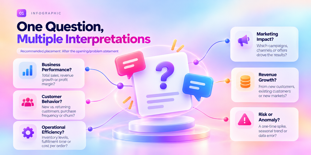
Some of the most dangerous words in enterprise analytics are the shortest ones. Average. Performance. Underperformer. Each sounds precise. Each hides a decision that changes what a chart actually says.
Marketing sees a campaign performing exceptionally well. Finance questions the revenue calculation. Sales asks why existing customers were included in a new-business comparison.
Everyone is looking at the same visualization. Yet everyone may be interpreting a different answer.
This is one of the challenges of conversational analytics: An AI system can generate a chart that looks convincing without necessarily capturing the business question correctly.
Large language models (LLMs) make it easier than ever to ask questions in natural language. You can type, “Show me sales by region, highlight the underperformers, and add an average line.” But turning that request into a reliable business answer requires more than generating a chart.
Which sales metric should be used? What defines an underperformer? Should the average be calculated across regions or weighted by sales volume? Which data should the user be allowed to access?
These decisions determine what the visualization communicates.
The missing piece is a structured connection between human intent, business meaning, analytical calculations, and visual representation.
And as enterprise organizations move toward agentic analytics, that connection becomes increasingly important.
The Real Problem: An LLM Can Understand a Question. Can It Preserve Its Meaning?
A natural-language request often appears simple.
“Show campaign performance by region, highlight the underperformers, and add an average.”
But what does performance mean?
• Revenue generated?
• Qualified leads?
• Conversion rate?
• Return on advertising spend?
And what does underperformer mean?
• A region below its target?
• A region performing below the company average?
• A region declining compared with the previous period?
Even the word average requires context. An average across regional revenue may answer a different question from an average transaction value.
Before a visualization is created, the system needs to resolve these ambiguities.
This matters because a chart can be technically well-rendered and still answer the wrong question.
Consider a sales manager who wants to identify regions missing their targets.
A chart that simply highlights the shortest revenue bars could mislead the manager. A smaller region may have lower revenue but still exceed its target, while the region with the highest revenue may be underperforming against its own goal.
Revenue determines the bar length. Performance against target determines the emphasis.
The distinction is not cosmetic. It changes the business interpretation.
From Business Question to Reliable Visualization
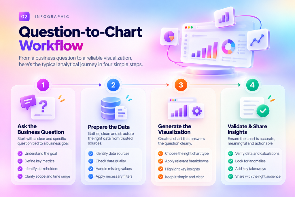
A dependable AI analytics experience needs a way to preserve the meaning of a user’s request throughout the analytical process.
Each stage addresses a different potential failure.
A metric can be defined incorrectly. A calculation can use the wrong population. A chart can emphasize a comparison that does not match the question. A visual can be technically correct but difficult to interpret.
The objective is not merely to generate an attractive chart. It is to create a visual representation that users can examine, question, and refine.
What ChartSpec Teaches Us About AI-Generated Charts
ThoughtSpot’s ChartSpec provides an example of how a structured language can connect analytical intent with visualization.
According to ThoughtSpot’s explanation, ChartSpec describes visual elements and relationships, allowing software to construct and validate chart structures. It separates the model’s interpretation from the code that generates the visualization.
This approach illustrates an important principle: AI should not have to communicate its entire analytical intent through an unconstrained visual output.
A structured representation can make parts of that intent explicit, including:
• Which fields are being used.
• How data is grouped or compared.
• Which calculations are applied.
• What visual emphasis is required.
• How follow-up changes should be handled.
For example, a user might say: “Keep the same comparison, but highlight regions below target.”
The intended change is narrow. The measure, reporting period, and population should remain consistent unless the user requests otherwise.
A structured representation provides a way for software to distinguish the requested edit from an unintended change to the analysis.
ChartSpec is ThoughtSpot’s implementation, not an established universal industry standard. Its broader lesson is that the meaning behind a chart needs a representation that systems can inspect and revise.
Why Business Context Matters More Than Ever
The language between LLMs and charts is only one part of the larger enterprise analytics challenge.
A chart specification can describe how a metric should be displayed. It does not, by itself, determine whether the underlying metric has the correct business definition or whether the user should have access to the data.
These responsibilities must work together.
1. Business definitions
Two departments may use the same term but mean different things. For example, revenue could refer to recognized revenue, billed revenue, or a particular reporting period. AI analytics needs access to the relevant business definitions to avoid confusing similar concepts.
2. Governed access
Enterprise data is not universally accessible to every user. Role-based permissions and appropriate access controls are important when analytics systems interact with sensitive business information.
3. Calculation consistency
A chart should use the appropriate calculation for the question. An average, growth rate, or comparison can produce different interpretations depending on the underlying data and formula.
4. Traceability
When a business user questions an insight, they should have a way to understand the basis of the answer where the system supports it.
Together, these considerations point toward a broader principle:
Trustworthy AI analytics requires more than conversational interaction. It requires governed meaning, reliable calculations, and transparent analytical behavior.
What the Industry Is Moving Toward?
Developments across the analytics industry demonstrate that conversational analytics is expanding beyond simple question-and-answer experiences.
Google Cloud has described conversational analytics capabilities in BigQuery and Looker, including workflows involving data exploration and agents. Tableau has discussed conversational experiences grounded in semantic models and connections to external agents. Microsoft Power BI includes verified answers for recurring questions through approved visual responses.
These approaches operate at different layers of the analytics experience. They do not establish a shared industry-wide chart specification standard.
However, they illustrate an important direction: enterprises need ways to combine natural-language interaction with business definitions, data access, and consistent analytical outputs.
For organizations evaluating AI analytics platforms, the important question is not simply: “Can the system generate a chart?”
It is: “Can the system preserve the meaning of my business question and help me trust the answer?”
From AI-Generated Insights to Governed Agentic Analytics
This is where the conversation extends beyond chart generation.
Enterprise teams increasingly want AI to do more than retrieve information. They want systems that can help investigate trends, identify exceptions, explain performance changes, and support business decisions.
But increased autonomy also raises important questions:
• Which data can an agent access?
• Which business definitions should it use?
• How are calculations validated?
• Can users understand the basis of its conclusions?
• What happens when the question is ambiguous?
At Quaeris.ai, our positioning around Governed Agentic Analytics is built around the importance of trusted analytics, business context, and controlled AI-driven decision support.
Our perspective is that enterprise AI should not be defined only by how naturally it can respond. It should also be evaluated by how reliably it operates within the business’s definitions, permissions, and governance requirements.
That means the conversation should move beyond “Ask your data anything” toward a more meaningful question:
Can your AI help your teams make decisions using analytics they can trust?
Quaeris.ai’s specific capabilities, integrations, and validation mechanisms should be evaluated against this principle and demonstrated through real product workflows.
A Practical Way to Evaluate AI Analytics
The next time you evaluate an AI-powered analytics experience, don’t stop after the first chart.
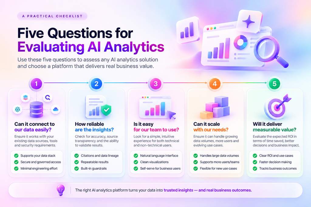
Try a short sequence of follow-up questions.
Step 1: Ask a business question
“Show campaign performance by region.”
Step 2: Request a comparison
“Highlight regions performing below their targets.”
Step 3: Change the reporting period
“Now show the same analysis for the previous quarter.”
Step 4: Ask for an explanation
“Why is this region highlighted?”
Step 5: Inspect the answer
Check whether the definitions, calculations, filters, and visual emphasis still match the original intent.
This sequence can help reveal whether the system handles analytical continuity and transparency effectively.
A reliable experience should also be willing to ask for clarification when the question is ambiguous.
For example: “When you say ‘best campaign,’ do you mean revenue, profitability, or conversion rate?”
Sometimes the most useful response an AI system can provide is not a chart. It is a clarifying question.
The Future of AI Analytics Is More Than Faster Charts
The evolution of conversational analytics is not simply about making chart generation faster.
It is about making the relationship between questions, data, calculations, and visual explanations more dependable.
As AI analytics becomes part of enterprise workflows, users will increasingly expect to:
• Understand what a metric represents.
• Inspect the basis of an analytical answer.
• Refine a visualization without accidentally changing the underlying question.
• Work with data within appropriate governance controls.
• Move from insights toward informed business decisions.
A structured language between LLMs and charts is one possible component of that future. It helps make visual intent more explicit and provides a basis for examination and revision.
But reliable enterprise analytics requires the larger system to work together: business meaning, governed data, analytical reasoning, and visualization.
The real test of AI analytics begins after the first chart.
When someone points to a visualization and asks, “Why should I believe this?”—the system should have a meaningful way to help them understand the answer.
How Quaeris.ai Approaches Trusted Analytics
Enterprise decisions deserve more than fast answers. They need context, consistent metrics, and governance.
Quaeris.ai’s Governed Agentic Analytics positioning focuses on connecting enterprise analytics with trusted AI agents and decision intelligence.
Explore how Quaeris.ai can support your organization’s approach to governed analytics and AI-driven decision-making.
| Ready to Explore Governed Agentic Analytics? Discover how Quaeris.ai approaches trusted analytics and enterprise decision intelligence. |